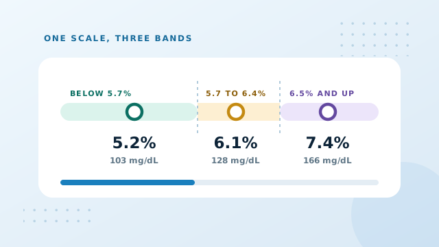
A1C Chart Ranges Explained Level By Level
An A1C chart is a lookup table. On one side sits a percentage, on the other sits the average glucose that percentage corresponds to, and somewhere in the middle sit the boundaries that decide which label a result carries. This guide walks the whole scale from the low forties through to the high teens, explains what changes as you move along it, and points out the places where a chart quietly stops being helpful.
What an A1C chart is really showing you
Every row on the chart holds the same three facts expressed three ways. The percentage is what the laboratory measured. The two glucose figures beside it are calculated from that percentage using a single published relationship, not measured separately. Nothing extra is being introduced as you move across a row.
That matters, because it means a chart cannot tell you anything the percentage did not already contain. What it does is make the percentage legible. Very few people carry an intuition for what 7.3 percent feels like, whereas most people who check glucose at home have a firm sense of what 183 mg/dL or 10.2 mmol/L looks like on a screen.
The conversion is one straight line: eAG in mg/dL equals 28.7 times the A1C, minus 46.7. Divide that answer by eighteen for millimoles per litre. Our guide to estimated average glucose explains where the line came from.
The full chart, four to fourteen percent
Most published charts stop somewhere near ten. The table below runs further, because results above that point still arrive and still deserve a translation.
| A1C | eAG mg/dL | eAG mmol/L | Reference band |
|---|---|---|---|
| 4.0% | 68 | 3.8 | Below 5.7% |
| 4.5% | 82 | 4.6 | Below 5.7% |
| 5.0% | 97 | 5.4 | Below 5.7% |
| 5.5% | 111 | 6.2 | Below 5.7% |
| 5.7% | 117 | 6.5 | Prediabetes band opens |
| 6.0% | 126 | 7.0 | 5.7% to 6.4% |
| 6.4% | 137 | 7.6 | Prediabetes band closes |
| 6.5% | 140 | 7.8 | Diabetes threshold |
| 7.0% | 154 | 8.6 | 6.5% and above |
| 7.5% | 169 | 9.4 | 6.5% and above |
| 8.0% | 183 | 10.2 | 6.5% and above |
| 8.5% | 197 | 11.0 | 6.5% and above |
| 9.0% | 212 | 11.8 | 6.5% and above |
| 10.0% | 240 | 13.4 | 6.5% and above |
| 11.0% | 269 | 14.9 | 6.5% and above |
| 12.0% | 298 | 16.5 | 6.5% and above |
| 13.0% | 326 | 18.1 | 6.5% and above |
| 14.0% | 355 | 19.7 | 6.5% and above |
The interactive chart on the home page covers the same ground in finer steps, and the calculator will convert any value you type rather than only the rows printed here.
Reading between the rows
Because the relationship is a straight line, the gaps between rows behave predictably. Every tenth of a percentage point is worth roughly 2.9 mg/dL, or about 0.16 mmol/L. That single fact lets you estimate any value the chart skips.
A result of 6.7 percent, for instance, sits two tenths above 6.5. Two tenths is close to 5.7 mg/dL, so 140 plus 6 gives about 146 mg/dL. The calculator returns 145, and the small difference is only rounding. Nothing more complicated is happening.
Percentage points, not percent
Moving from 8.0 to 7.0 is a fall of one percentage point, not a fall of one percent. Describing it as one percent implies a change of 0.08, which is roughly a twelfth of what actually happened. The distinction sounds pedantic until somebody misreads a note in a record, so the tables and the change column throughout this site always say points.
Why the boundaries sit where they do
The two thresholds on the chart, 5.7 and 6.5, were not chosen because something biological switches on at those exact figures. They were drawn where large population studies found the risk of eye, kidney and nerve complications begins climbing more steeply. They are statistical dividing lines placed on a smooth curve.
Two consequences follow, and both are worth carrying with you.
- A result just under a threshold is not meaningfully different from one just over it. 6.4 and 6.5 describe almost identical bloodstreams. Only the label changes.
- Movement within a band still counts. Falling from 6.3 to 5.9 keeps the same label but represents a genuine change worth noticing.
This is why the trend chart plots your actual line across the bands rather than only reporting which band today's result landed in.
Where the chart stops being useful
A lookup table is a blunt instrument, and there are four situations where reading straight off it will mislead you.
When the reference bands do not apply to you
The bands describe general adult screening. Pregnancy runs on different guidance entirely, as does care for children and teenagers. Someone already diagnosed is working towards an agreed personal target rather than a screening threshold, and that target may sit well above 6.5 by design.
When something is shifting the measurement
Anemia, recent blood loss, pregnancy, kidney conditions and inherited hemoglobin variants all change the relationship between glucose and the measured percentage. The chart still converts faithfully, but the percentage it started from is no longer describing what you would assume. Our guide on factors affecting A1C covers each case.
When the same average hides different days
Two people at 7.0 percent can live very different days, one steady and one swinging between highs and lows. A chart cannot see that difference, which is exactly what time in range was designed to expose.
When you are comparing two laboratories
Methods vary slightly between providers. A step of a tenth or two after switching clinics may be the method rather than you.
Reading your report in millimoles per mole rather than percent? That is the IFCC scale, and it needs its own conversion. Our guide to A1C in mmol/mol lines the two systems up.
Using the chart well
The most productive habit is to stop treating the chart as a verdict machine and start treating it as a translator. Look up the row, note the glucose figures, then ask the two questions the chart cannot answer for you: which direction has the line been moving across recent visits, and is there anything about this particular test period that needs explaining.
Written down beside a date, those answers turn a lookup into a record. Doing that consistently is what makes a chart worth keeping.
Conclusion: Using An A1C Chart
An A1C chart translates one percentage into the glucose units you already understand, and marks where the screening thresholds fall. The relationship is a straight line, so every tenth of a point is worth about 2.9 mg/dL and you can read between the rows safely. What the chart cannot do is account for your own biology, the shape of your days, or the direction you have been heading.
Enter your result for the exact conversion, then add the date so the next reading has something to sit beside.