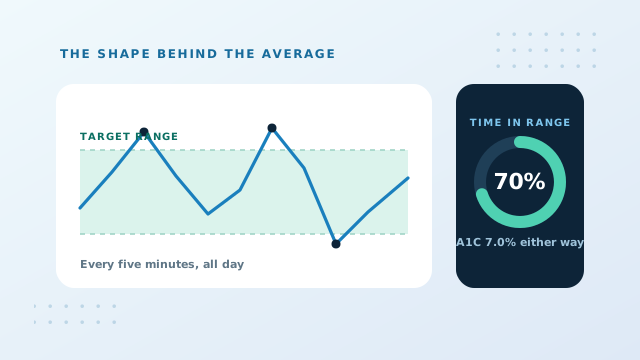
A1C vs Time In Range: Two Views Of Control
An A1C compresses three months into one number. That compression is its greatest strength and its most serious limitation at the same time, because an average is blind to the shape of what it averages. Time in range was developed to describe exactly what the average discards.
The problem with a single average
Consider two people who both receive an A1C of 7.0 percent, which converts to an estimated average glucose of about 154 mg/dL or 8.6 mmol/L.
The first drifts gently between 120 and 180 all day. The second alternates between hypoglycemic lows in the fifties and spikes over 300, and those extremes cancel out arithmetically. The average is genuinely identical. The days are not remotely comparable, and the second person is experiencing episodes that carry immediate risk.
An average cannot distinguish a steady line from a violent oscillation around the same midpoint. That is not a flaw in the A1C, it is a property of averages. It is simply a reason not to rely on one alone when better data is available.
What time in range measures
A continuous glucose monitor takes a reading every few minutes, day and night. Time in range reports what proportion of those readings fell inside an agreed target band. For most adults, that band is 70 to 180 mg/dL, or 3.9 to 10.0 mmol/L.
Because the sensor never sleeps, the figure includes the hours no fingerstick ever captures: the middle of the night, the two hours after dinner, the walk that dropped things lower than expected.
| Metric | Glucose band | Commonly quoted goal |
|---|---|---|
| Time in range | 70 to 180 mg/dL | Above 70% of the day |
| Time above range | Above 180 mg/dL | Under 25% |
| Time well above range | Above 250 mg/dL | Under 5% |
| Time below range | Under 70 mg/dL | Under 4% |
| Time well below range | Under 54 mg/dL | Under 1% |
Targets differ for pregnancy, for older or frail adults, and for children, so treat the column above as the general adult case rather than a personal instruction.
Where the two measures agree
Across large groups, time in range and A1C track each other closely. More time spent inside the band means a lower average, which means a lower percentage. As a very rough rule of thumb, every ten percentage points of time in range corresponds to somewhere around half a percentage point of A1C.
That relationship holds at population level and drifts considerably for individuals, so it is useful for orientation rather than prediction. Two people with identical time in range figures can still return different laboratory results, for all the reasons covered in our guide on factors affecting A1C.
Where they diverge, and why it matters
| Pattern | Time in range | Time below 70 | What the A1C shows |
|---|---|---|---|
| Steady, gentle drift | 78% | 1% | A reassuring figure, correctly |
| Frequent lows and highs | 52% | 9% | A reassuring figure, misleadingly |
| High overnight, tight by day | 64% | 0% | Slightly raised, cause invisible |
The middle row is the case that matters most. A comfortable A1C accompanied by nine percent of the day spent below 70 mg/dL is not good control, it is instability that happens to average out. Nothing about the laboratory number reveals this, which is why an A1C should never be read as evidence that lows are not occurring.
Why the A1C still matters
None of this makes the laboratory test obsolete, and three reasons keep it central.
- It is universally available. Sensors are not accessible to everybody, everywhere, and a blood draw is.
- The evidence base is built on it. Decades of outcome research linking glucose control to complication risk used this measurement. Guidance is written in its language.
- It is independent of a device. Sensors have their own calibration behaviour, wear time and occasional failures. A laboratory result is a separate check on the picture.
The realistic position is that the two answer different questions. The A1C answers whether the long term average sits where it should. Time in range answers what the days actually look like, and whether anybody is spending part of them somewhere dangerous.
Using both in one record
If you have access to sensor data, the useful habit is to write down the time in range figure alongside each laboratory result rather than in a separate app. The two together tell a story neither manages alone: the percentage says where the average landed, the range figure says how it got there.
The note field in the history mode of the calculator is a reasonable place to keep that pairing, and it carries through to the printed report you can bring to an appointment. Our guide on building a trend chart covers assembling the record, and the glucose management indicator explains the sensor derived figure that often appears beside time in range.
Conclusion: A1C vs Time In Range
An A1C reports where your average sat across three months. Time in range reports how much of each day was spent inside a safe band, including the hours nobody tests. Identical percentages can hide wildly different days, and a comfortable A1C is never evidence that lows are absent. Where both are available, read them together.
Record each laboratory result with its date, and note the range figure beside it so the pair stays connected.